Applied filters:


Card added:
April 7, 2021

Winc
Recommended products in the cart summary
Desktop site
Global element
page
Food/grocery
New

Card added:
April 7, 2021

Winc
Visually select subscription contents
Desktop site
Subscription
page
Food/grocery
New

Card added:
June 25, 2021

West Elm
Ability to clear configuration options
Desktop site
Product details
page
Home/DIY
New

Card added:
June 25, 2021

Wayfair
Add-ons/cross-sells within cart preview
Mobile site
Cart/basket
page
Home/DIY
New


Card added:
April 7, 2021

Warby Parker
An expand to display more information
Mobile site
Product details
page
Accessories
New


Card added:
April 7, 2021

Volkswagen
Clear signposting of progress
Desktop site
Product details
page
Automotive
New

Card added:
April 7, 2021

Victoria Secret
A sticky CTA to access current promotions
Desktop site
Homepage
page
Fashion
New


Card added:
April 7, 2021

Urban Outfitters
Empty cart shows products to get started
Mobile site
Cart/basket
page
Fashion
New

Card added:
April 7, 2021

Urban Outfitters
Remove all out of stock items in 1 click
Mobile site
Cart/basket
page
Fashion
New


Card added:
April 7, 2021

Urban Outfitters
The next row is shown above the fold
Mobile site
Product listing
page
Fashion
New

Card added:
April 7, 2021

Urban Outfitters
Pushing products with custom labels
Mobile site
Product listing
page
Fashion
New

Card added:
April 7, 2021

Urban Outfitters
A dropdown to browse cross-category
Mobile site
Product listing
page
Fashion
New


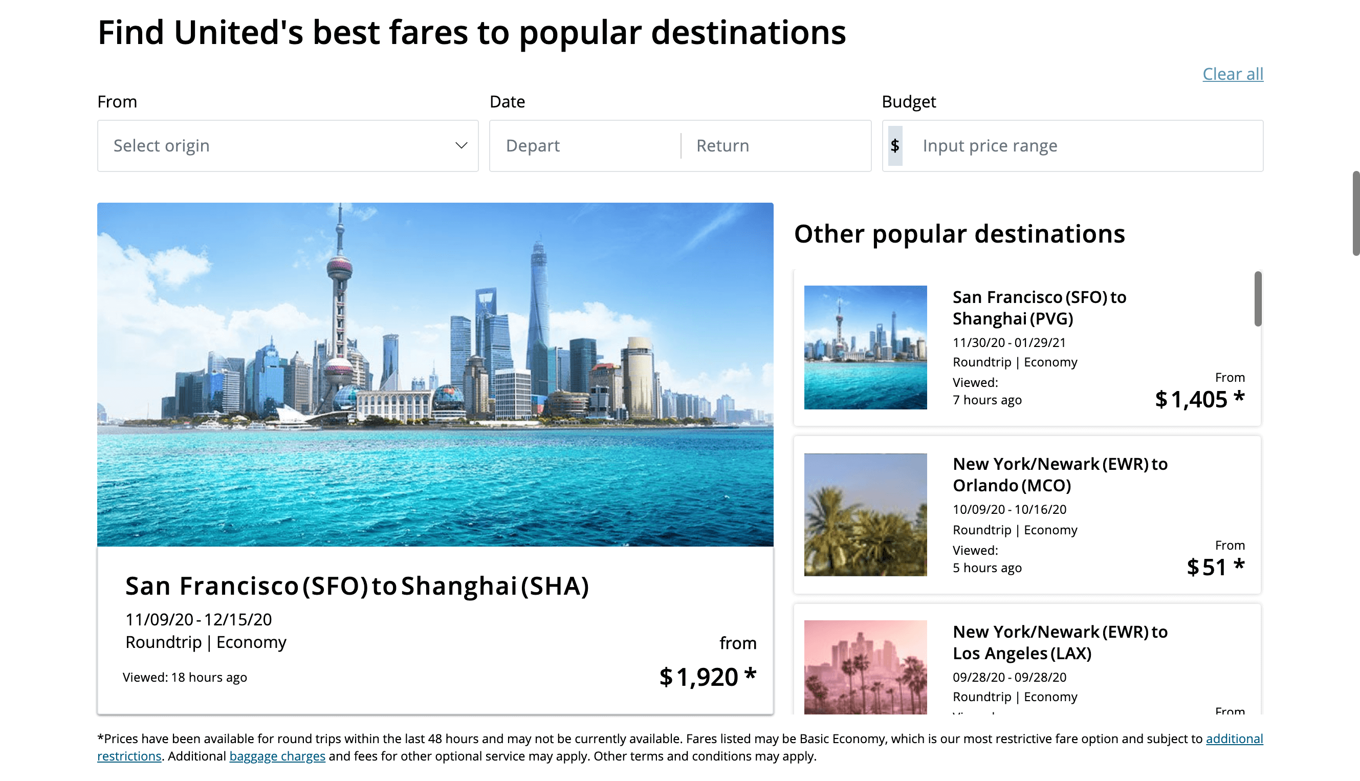
Card added:
April 7, 2021

United Airlines
Ability to filter deals and offers
Desktop site
Promotions
page
Travel
New

Card added:
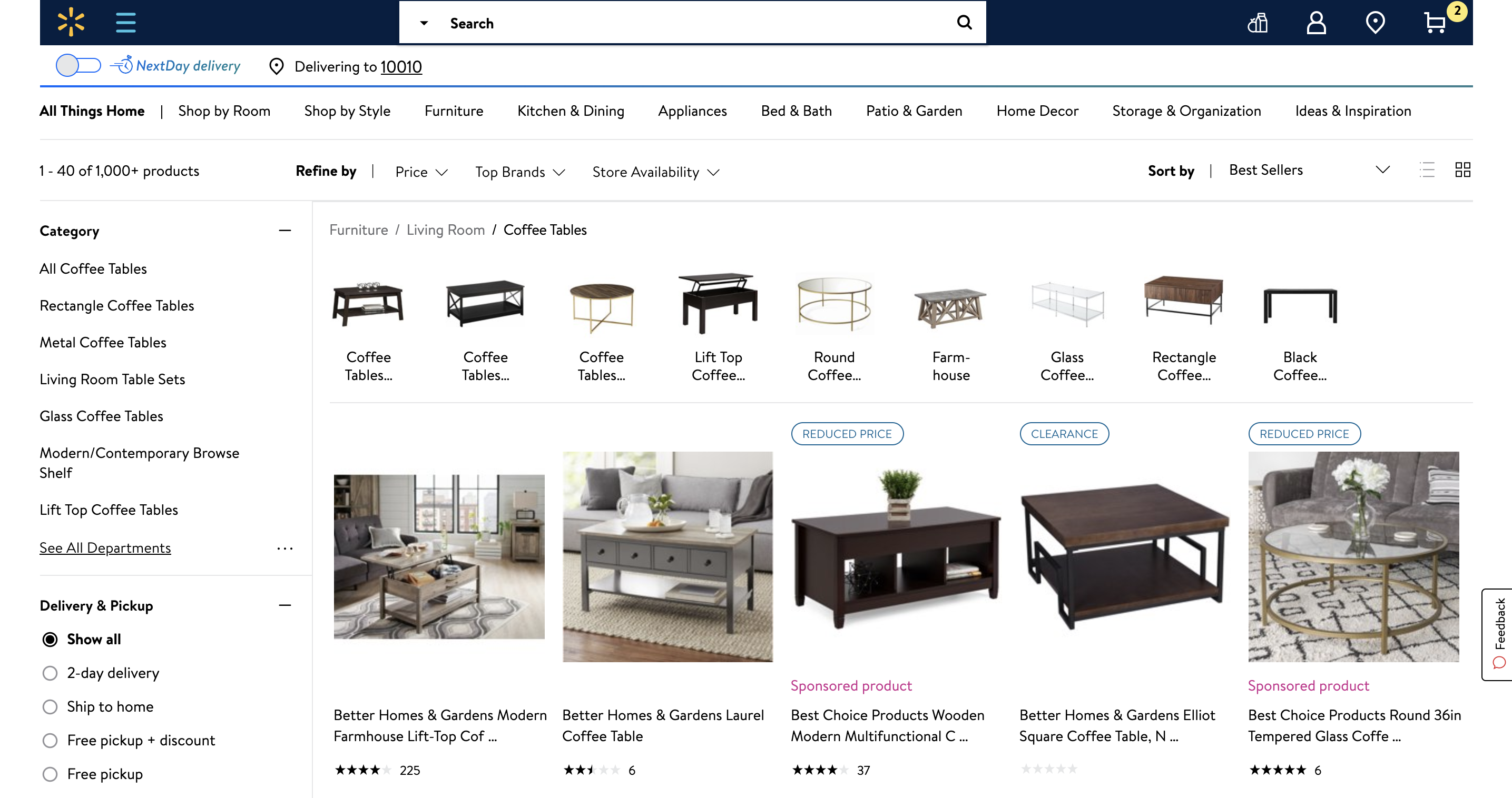
April 7, 2021

Ultimate Ears
Comparison table for different products
Desktop site
Product details
page
Electronics
New
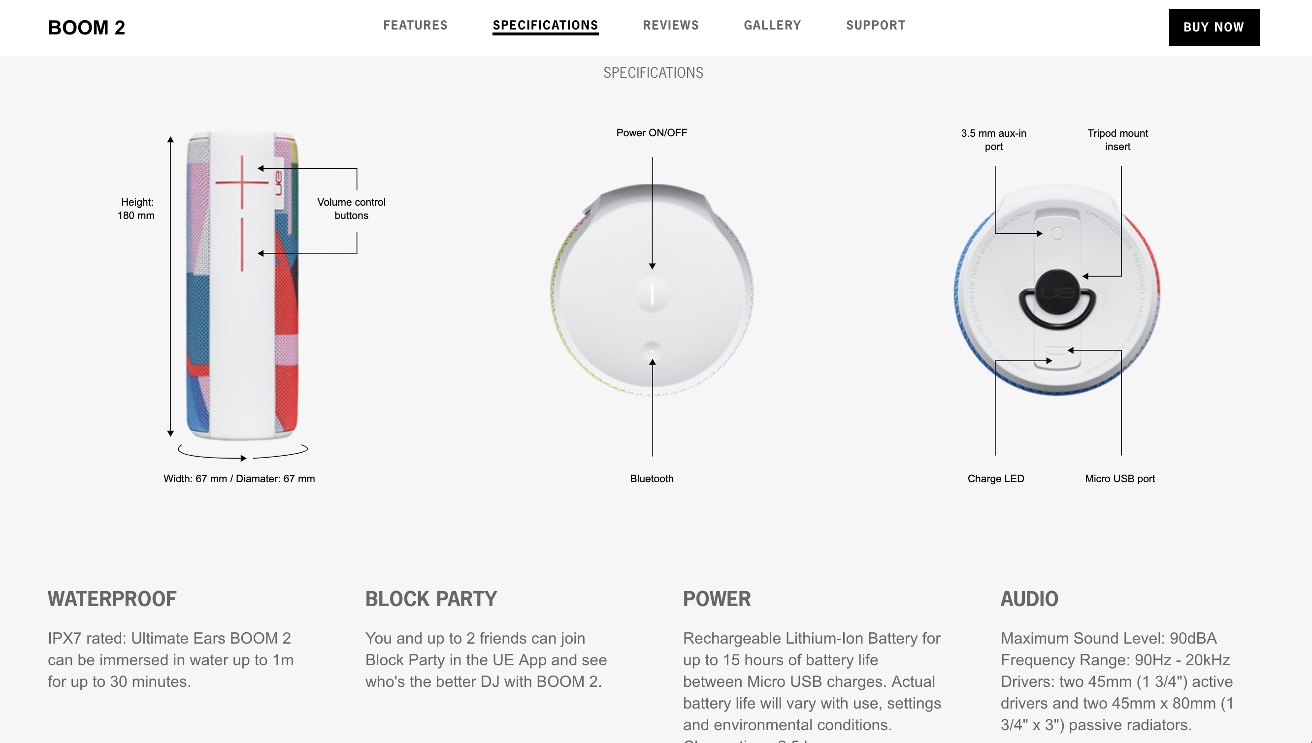
Card added:
April 7, 2021

Ultimate Ears
Annotations to highlight features
Desktop site
Product details
page
Electronics
New


Card added:
April 7, 2021

Tesla
Full page content with scroll indicator
Mobile site
Product details
page
Automotive
New

Card added:
April 7, 2021

Task Rabbit
Automatically suggests addresses as users type
Desktop site
Form
page
Services
New


Card added:
April 7, 2021

Target
Quick clear filters when no result shown
Desktop site
Search results
page
Retail
New


Card added:
April 7, 2021

Tag Heuer
A secondary navigation with an anchor
Desktop site
Product details
page
Luxury
New


Card added:
April 7, 2021

Squarespace
Engaging carousel with a time progress bar
Desktop site
Content/info
page
Telco
New


Card added:
April 7, 2021

Slack
Search term remains inside search field
Desktop site
Support
page
Internet/tech
New


Card added:
April 7, 2021

SimpliSafe
Info changes when product is hovered on
Desktop site
Content/info
page
Electronics
New

Card added:
April 7, 2021

Showpo
Quick add to bag using size selection
Desktop site
Product listing
page
Fashion
New

Card added:
April 7, 2021

Shopbop
Confirmation pop in and link to the checkout
Desktop site
Product details
page
Fashion
New

Card added:
April 7, 2021

Shopbop
The status of the stock in the cart page
Desktop site
Cart/basket
page
Fashion
New


Card added:
April 7, 2021

Sézane
Slider to navigate to other sub-categories
Mobile site
Product listing
page
Fashion
New


Card added:
April 7, 2021

Sephora
Bottom navigation with a sticky add to cart CTA
Mobile site
Global element
page
Beauty
New


Card added:
April 7, 2021

Savannahs
Available sizes appear on hover
Desktop site
Product listing
page
Accessories
New

Card added:
April 7, 2021

Savage x Fenty
Models size and key info above the fold
Mobile site
Product details
page
Fashion
New

Card added:
April 7, 2021

Samsung
Sticky comparator at the bottom of the page
Desktop site
Product listing
page
Electronics
New


Card added:
April 7, 2021

Reiss
Navigation flexibility in the product page
Mobile site
Product details
page
Fashion
New

Card added:
April 7, 2021

Ralph Lauren
Editorial content with 'Shop the look'
Desktop site
Content/info
page
Fashion
New


Card added:
April 7, 2021

Ralph Lauren
Contrasted background for menu elements
Mobile site
Global element
page
Fashion
New


Card added:
April 7, 2021

Nordstrom
Inspirational cross sell /Shop this look
Desktop site
Product details
page
Fashion
New


Card added:
April 7, 2021

Nike
Cart summary can be expanded using an accordion
Mobile site
Checkout
page
Fashion
New


Card added:
April 7, 2021

Netflix
A carousel to facilitate prospecting
Desktop site
Homepage
page
Entertainment
New

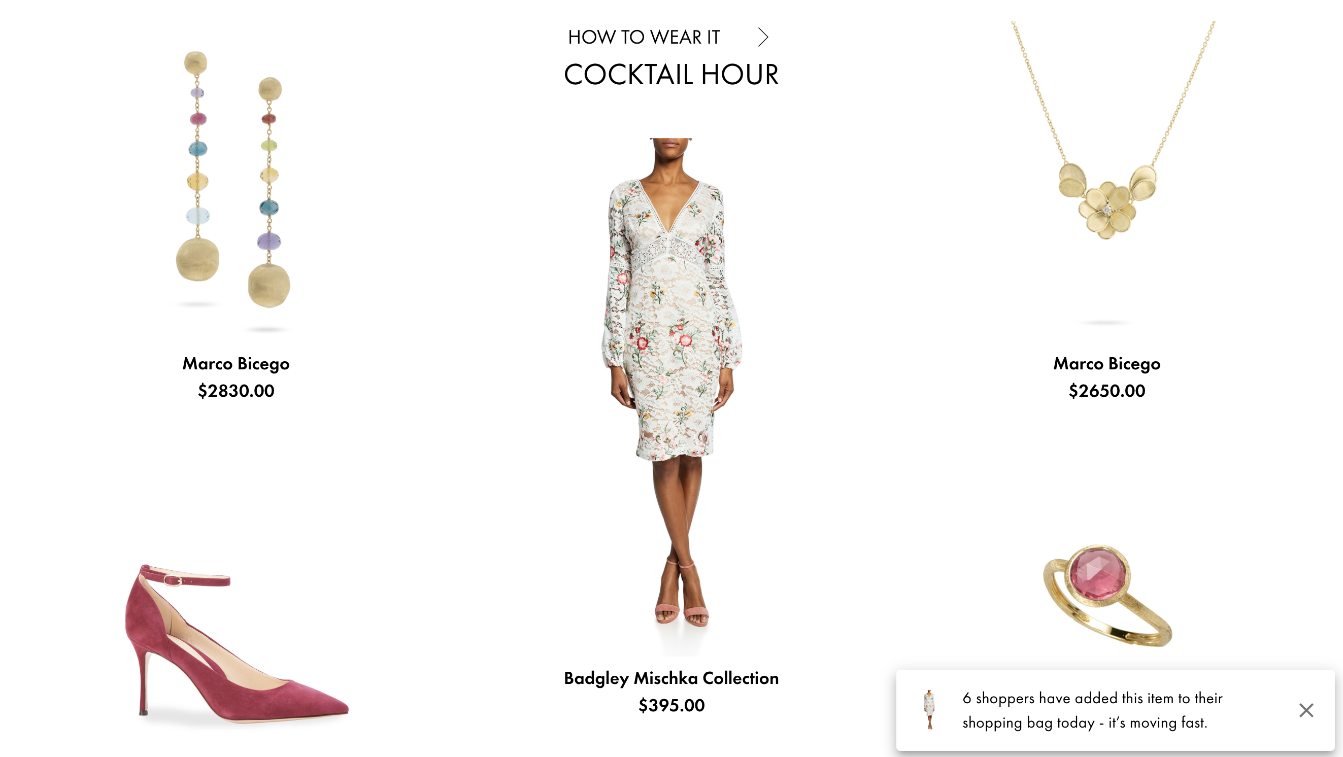
Card added:
April 7, 2021

NET-A-PORTER
CTA is displayed at both the top and bottom
Desktop site
Cart/basket
page
Luxury
New

Card added:
April 7, 2021
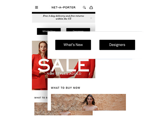
NET-A-PORTER
Viewing the next section above the fold
Mobile site
Homepage
page
Fashion
New

Card added:
April 7, 2021

Nerd Wallet
Mortgage calculator with breakdowns
Desktop site
Configurator
page
Finance
New

Card added:
April 7, 2021

National Geographic
Carousel to promote new-in
Desktop site
Homepage
page
Entertainment
New


Card added:
April 7, 2021

MVMT
Allow the user to add a complementary product
Desktop site
Product details
page
Fashion
New


Card added:
April 7, 2021

Monday
USPs take less space by using side tabs
Desktop site
Product details
page
Internet/tech
New

Card added:
April 7, 2021

Miu Miu
Product colors are accessible in a popup
Mobile site
Product details
page
Luxury
New

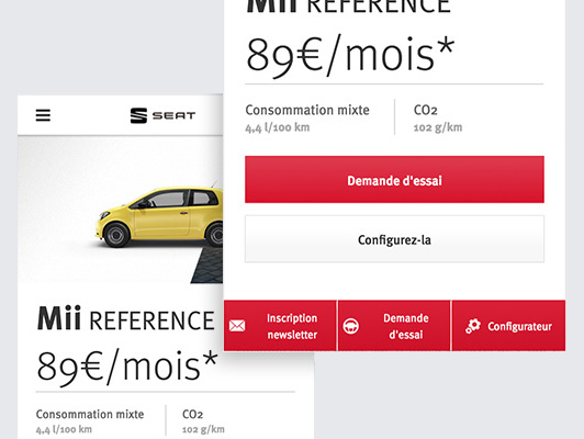
Card added:
April 7, 2021

Mini
Configurator to personalize the product
Desktop site
Configurator
page
Automotive
New


Card added:
April 7, 2021
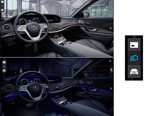
Mercedes
Switch to see your choices at night
Desktop site
Configurator
page
Automotive
New

Card added:
April 7, 2021

Medium
Able to adjust algorithm affecting feed
Desktop site
Settings
page
News/publications
New

Card added:
April 7, 2021

Mediapart
Sticky menu when scrolling down the page
Desktop site
Global element
page
News/publications
New


No results found, whoopsie daisy!
Clear all filters