Applied filters:

Card added:
April 7, 2021

Max Mara
Heart icon to save products for later
Desktop site
Product details
page
Luxury
New


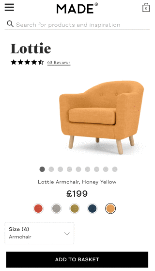
Card added:
June 25, 2021

Maisons du Monde
Load more button with progress bar
Mobile site
Product listing
page
Home/DIY
New

Card added:
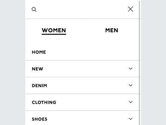
April 7, 2021

Madewell
Navigation to same category in opposite gender
Mobile site
Search results
page
Fashion
New

Card added:
April 7, 2021

Madewell
Category push using videos and descriptions
Desktop site
Product listing
page
Fashion
New


Card added:
April 7, 2021

Madewell
Product size with model height included
Mobile site
Product details
page
Fashion
New

Card added:
April 7, 2021

Madewell
Two separate entries for men and women
Desktop site
Global element
page
Fashion
New


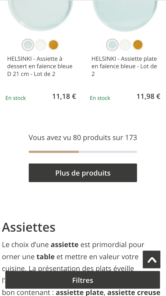
Card added:
June 25, 2021

Made
Quickly and easily narrows down the product catalog
Desktop site
Product listing
page
Home/DIY
New


Card added:
April 7, 2021

Lululemon
Horizontal slider for color swatches
Mobile site
Product details
page
Fashion
New


Card added:
April 7, 2021

Lo & Sons
The navigation bar stays sticky
Mobile site
Global element
page
Accessories
New


Card added:
April 7, 2021

Lo & Sons
Stars anchor to the review section
Mobile site
Product details
page
Fashion
New
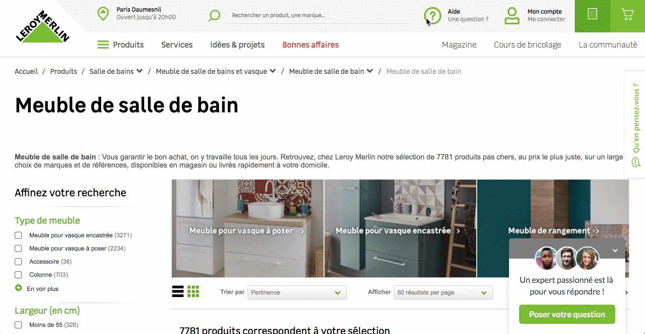
Card added:
June 25, 2021

Leroy Merlin
Breadcrumbs as cross-category navigation
Desktop site
Global element
page
Home/DIY
New

Card added:
April 7, 2021

Lenscrafters
Map moves dependant on shop details tile
Mobile site
Content/info
page
Accessories
New


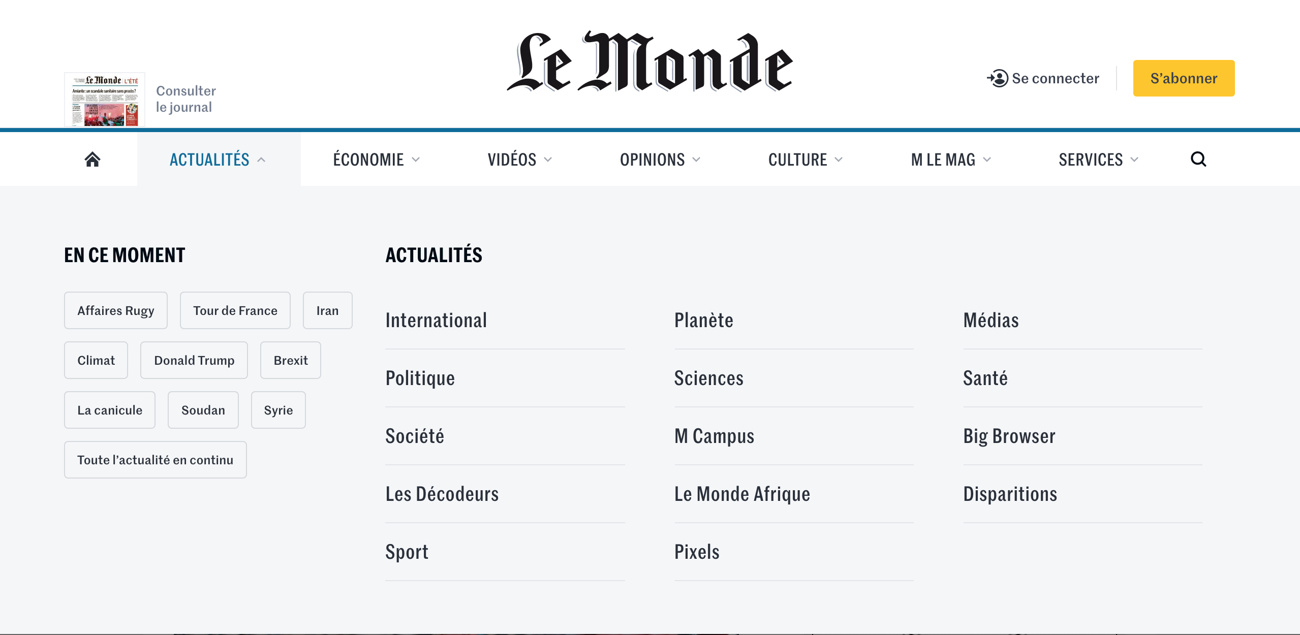
Card added:
April 7, 2021

Le Monde
Trend topics displayed on the menu
Desktop site
Global element
page
News/publications
New


Card added:
April 7, 2021

Kickstarter
Progress bar used to jump between steps
Desktop site
Checkout
page
Retail
New

Card added:
April 7, 2021

Kayak
Color-coded calendar indicates price ranges
Desktop site
Booking
page
Transport
New

Card added:
April 7, 2021

Kayak
Side navigation expands and collapses
Desktop site
Global element
page
Transport
New


Card added:
April 7, 2021

Kate Spade
Push promotion through PLP containers
Mobile site
Product listing
page
Fashion
New

Card added:
June 25, 2021

Joybird
Relevant cross-sells in the cart summary
Desktop site
Cart/basket
page
Home/DIY
New

Card added:
June 25, 2021

Joybird
Insurance cross-sell in the cart summary
Desktop site
Global element
page
Home/DIY
New

Card added:
June 25, 2021

Joybird
Recently viewed items tab in the cart
Desktop site
Global element
page
Home/DIY
New

Card added:
June 25, 2021

Joybird
Key informations above the fold line
Mobile site
Product details
page
Home/DIY
New

Card added:
June 25, 2021

Joybird
Dynamic color and material selection
Desktop site
Product details
page
Home/DIY
New


Card added:
April 7, 2021

Jet
The details of shipping and delivery on the pdp
Mobile site
Product details
page
Retail
New


Card added:
April 7, 2021

Invision
Sticky secondary nav for blog content
Desktop site
Content/info
page
Internet/tech
New

Card added:
April 7, 2021

Invision
Clear and defined dropdown menu
Desktop site
Global element
page
Internet/tech
New

Card added:
April 7, 2021

Invision
Newsletter sign-up slides in from above
Desktop site
Global element
page
Internet/tech
New

Card added:
June 25, 2021

Interior Define
CTA next to cross-sell of the related category
Desktop site
Product details
page
Home/DIY
New


Card added:
April 7, 2021

Hulu
Easy comparison of subscription options
Desktop site
Subscription
page
Entertainment
New

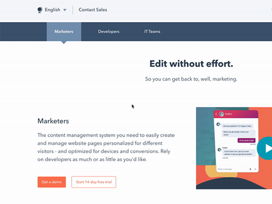
Card added:
April 7, 2021

Hubspot
Toggle between annual and yearly subscription options
Desktop site
Subscription
page
Internet/tech
New

Card added:
April 7, 2021

Hubspot
Chatbot with FAQs and support questions
Desktop site
Global element
page
Internet/tech
New

Card added:
April 7, 2021
Hubspot
Tabs break details into use cases
Desktop site
Product details
page
Internet/tech
New


Card added:
April 7, 2021
HSBC
One column form to facilitate the completion
Desktop site
Subscription
page
Finance
New
Card added:
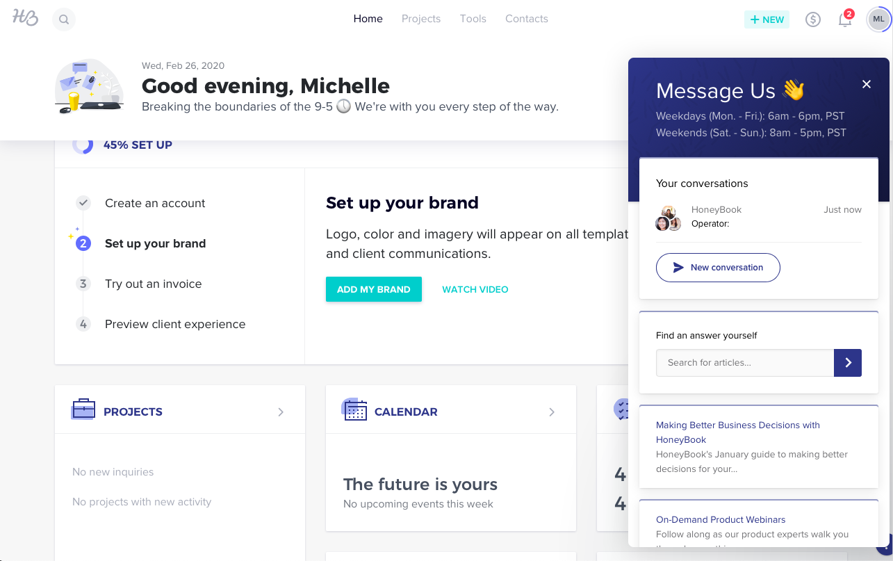
April 7, 2021

Honeybook
Prompts users to FAQs before chat
Desktop site
Global element
page
Services
New


Card added:
April 7, 2021

HONDA
3D product image with ability to rotate and configure
Desktop site
Configurator
page
Automotive
New

Card added:
April 7, 2021

Hollister
Category push within cart's empty state
Desktop site
Cart/basket
page
Fashion
New


Card added:
June 25, 2021

Hayneedle
Sticky sub-navigation to anchor sections
Desktop site
Product details
page
Home/DIY
New


Card added:
April 7, 2021

Harrington
Filters remains sticky on the left hand side
Desktop site
Product listing
page
Fashion
New

Card added:
April 7, 2021

H&R Block
Choices direct users to the best product
Mobile site
Configurator
page
Finance
New


Card added:
April 7, 2021

H&M
Description placement increase exposure
Desktop site
Product details
page
Fashion
New


Card added:
April 7, 2021

Gumtree
Search engine displayed on the homepage
Desktop site
Homepage
page
Automotive
New


Card added:
April 7, 2021

Guerlain
Ability to view image with 3D rotation
Desktop site
Product details
page
Beauty
New


Card added:
April 7, 2021

Glossier
Best selling product images in menus
Desktop site
Global element
page
Beauty
New


Card added:
April 7, 2021

Glossier
Breadcrumb and slider on product list
Mobile site
Product details
page
Beauty
New

Card added:
April 7, 2021
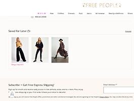
Free people
Move items between saved list and cart
Desktop site
Cart/basket
page
Fashion
New


Card added:
June 25, 2021

Floyd
Graphic GIF highlighting a product feature
Mobile site
Product details
page
Home/DIY
New

Card added:
April 7, 2021

Flamingo
Bundled product info in a modal on click
Desktop site
Product details
page
Beauty
New

Card added:
April 7, 2021

Fiat
Horizontal Scroll In-Page Navigation
Mobile site
Product details
page
Automotive
New

Card added:
April 7, 2021

Ferrari
Immersive media in the configurator
Desktop site
Configurator
page
Automotive
New

Card added:
April 7, 2021

Fenty Beauty
Notification that informs the user of a promotion
Desktop site
Product details
page
Beauty
New


Card added:
April 7, 2021

Ellevest
Drag and drop to prioritise investments
Desktop site
Configurator
page
Finance
New


No results found, whoopsie daisy!
Clear all filters