Applied filters:


Card added:
April 7, 2021

Daybreaker
Available dates can be seen in the calendar
Mobile site
Product listing
page
Entertainment
New


Card added:
April 7, 2021

Dagne Dover
Category tiles and carousels in menus
Mobile site
Global element
page
Accessories
New


Card added:
April 7, 2021

Credit Karma
Dashboard screen with data visualisation
Mobile app
Homepage
page
Finance
New

Card added:
April 7, 2021

Credible
FAQ accordions with additional links to learn more
Mobile site
Product details
page
Finance
New


Card added:
April 7, 2021

Credible
Tile shows key info to help users decide
Mobile site
Search results
page
Finance
New

Card added:
June 25, 2021

Crate & Barrel
Save for later button marked clearly on cart listings
Desktop site
Cart/basket
page
Home/DIY
New

Card added:
April 7, 2021

Clinique
Labels on listing images provide context
Desktop site
Product listing
page
Beauty
New


Card added:
April 7, 2021

Carvana
Filter prompts in place of product tiles
Desktop site
Product listing
page
Automotive
New

Card added:
April 7, 2021

Carvana
Financing calculator with sliders
Desktop site
Product details
page
Automotive
New

Card added:
April 7, 2021

Carvana
Search field within a filter category
Desktop site
Product listing
page
Automotive
New

Card added:
April 7, 2021

Carvana
Anchor links to scroll to page sections
Desktop site
Product listing
page
Automotive
New

Card added:
April 7, 2021

Cars
Clear all and applied filters above PLP
Desktop site
Product listing
page
Automotive
New

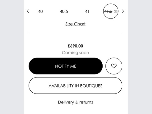
Card added:
April 7, 2021

Cariuma
Both men and women size selection options displayed
Mobile site
Product details
page
Fashion
New


Card added:
April 7, 2021

Carbon38
Ability to quickly add to cart from the cross-sell
Mobile site
Content/info
page
Fashion
New

Card added:
April 7, 2021

Calzedonia
Mega menu with images and categories
Desktop site
Global element
page
Fashion
New


Card added:
April 7, 2021

Brunello Cucinelli
Cross-sell products on model display
Desktop site
Product details
page
Luxury
New


Card added:
April 7, 2021

Book of the Month
Short and succint descriptions
Desktop site
Profile
page
Entertainment
New
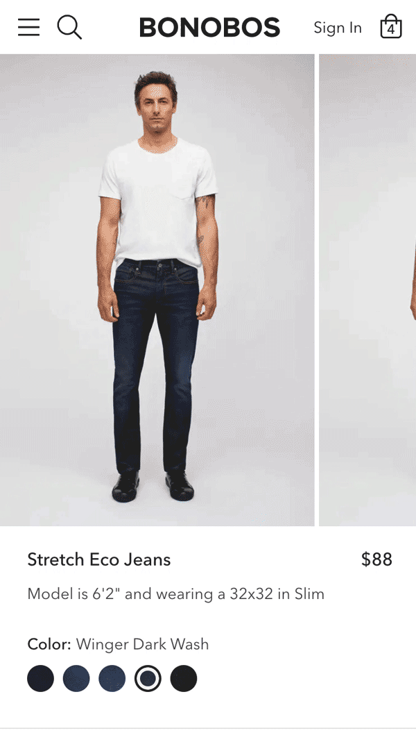
Card added:
April 7, 2021

Bonobos
Cart summary slider with close button
Mobile site
Product details
page
Fashion
New

Card added:
April 7, 2021

Bombas
Easily navigate to a sub-category page
Desktop site
Product listing
page
Accessories
New


Bed Bath & Beyond
Search functionality opens into a full-screen view
Mobile site
Global element
Home/DIY
Card added:
June 25, 2021

Bed Bath & Beyond
Search functionality opens into a full-screen view
Mobile site
Global element
page
Home/DIY
New

Card added:
June 25, 2021

Bed Bath & Beyond
Error message with suggested resolution
Desktop site
Login/sign up
page
Home/DIY
New


Card added:
June 25, 2021

Bed Bath & Beyond
Related categories below cross-sell
Desktop site
Product details
page
Home/DIY
New

Card added:
June 25, 2021

Bed Bath & Beyond
Button to reveal extra product info
Mobile site
Product details
page
Home/DIY
New

Card added:
June 25, 2021

Bed Bath & Beyond
Discounts shown in the cart page
Desktop site
Cart/basket
page
Home/DIY
New

Card added:
June 25, 2021

Bed Bath & Beyond
Pop-in with applicable coupons
Mobile site
Cart/basket
page
Home/DIY
New


Card added:
April 7, 2021

bareMInerals
Selecting colours in a dropdown
Mobile site
Product details
page
Fashion
New

Card added:
April 7, 2021

Bain & Company
Easily filter articles and content
Desktop site
Content/info
page
Services
New

Card added:
April 7, 2021

Away That Day
Ability to change currency of product prices
Mobile site
Global element
page
Fashion
New


Card added:
April 7, 2021

Away
Easier navigation to other product with a banner
Desktop site
Product details
page
Travel
New


Card added:
April 7, 2021

Away
Cross navigation above product details
Desktop site
Product details
page
Accessories
New

Card added:
April 7, 2021

Atom Finance
High contrast market performance charts
Mobile site
Homepage
page
Finance
New
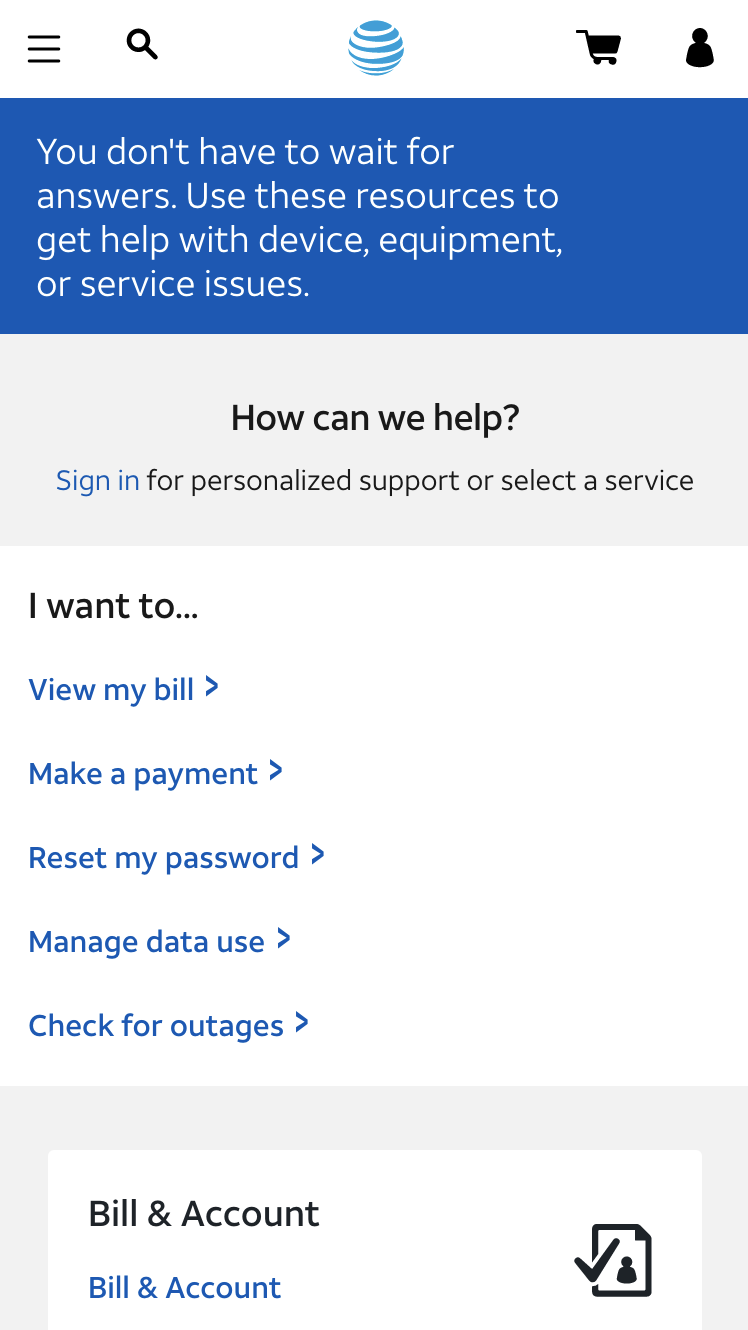
AT&T
Quick links to common support issues
Mobile site
Support
Telco
DESCRIPTION:
When users arrive to the support center, they are greeted with common and popular questions/tasks the user can navigate to. Users are also prompted to sign in for personalized support. Below the common questions/tasks, there are common support topics listed below.
HOW THIS FEATURE IMPROVES UX:
Immediately helps users address common problems. The language that is used is in first person, making it more personable and relatable, and easy to understand. The links are all actionable.

METRIC TIPS ON HOW TO VALIDATE IMPROVEMENT:
Do common CTAs such as these receive heavier engagement than other elements within Support? Compare its click rate, attractiveness rate, (and if possible, conversion rate per click), to ensure that these should be prioritized over topics, or if topics should take precedent.
Card added:
April 7, 2021

AT&T
Quick links to common support issues
Mobile site
Support
page
Telco
New


Card added:
April 7, 2021

Asana
Labels used to highlight specifics
Desktop site
Global element
page
Internet/tech
New

Card added:
April 7, 2021

Asana
Sub tiers in columns to easily compare
Desktop site
Subscription
page
Internet/tech
New


Card added:
April 7, 2021

Apple
User is scrolled from choice to choice
Desktop site
Configurator
page
Electronics
New


Card added:
April 7, 2021

Apple
Compare two products side by side
Desktop site
Product details
page
Electronics
New

Card added:
April 7, 2021

Apple
Password requirements when field active
Desktop site
Login/sign up
page
Electronics
New

Card added:
April 7, 2021

Andaz Hotels by Hyatt
Booking a hotel through a date picker
Desktop site
Homepage
page
Travel
New

Card added:
April 7, 2021

Ana Luisa
Time ticker counts down to a promotional sale
Mobile site
Global element
page
Fashion
New

Card added:
April 7, 2021

American Express
Common support topics above the fold
Desktop site
Support
page
Finance
New


Card added:
April 7, 2021

American Eagle
Location modal appears on detection
Mobile site
Global element
page
Fashion
New

Card added:
April 7, 2021

American Eagle
Shows nearest store with item in stock
Mobile site
Product details
page
Fashion
New

Card added:
April 7, 2021

American Eagle
Modal to easily edit cart contents
Mobile site
Cart/basket
page
Fashion
New

Card added:
April 7, 2021

American Eagle
Edit product details on cart page
Desktop site
Cart/basket
page
Fashion
New

Card added:
April 7, 2021

American Eagle
Sticky Order Summary & Checkout CTA
Desktop site
Cart/basket
page
Fashion
New


Card added:
April 7, 2021

American Eagle
A cross-sell within a preview pane
Desktop site
Product details
page
Fashion
New

Card added:
April 7, 2021

American Eagle
Category CTAs displayed on Hero Image
Desktop site
Homepage
page
Fashion
New


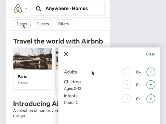
Card added:
April 7, 2021

Airbnb
Sign-up by phone number and more options
Mobile site
Login/sign up
page
Travel
New


No results found, whoopsie daisy!
Clear all filters